
One of the most frustrating stuff to do in CSS is to centralise something vertically. Most of the methods we know and tried are kind of ‘hack-ish’, but I’m going to list them out anyway.
Let’s assume that we have a little box (#content) that should be placed at the centre of a full-screen box (#container):

#container {
  width: 100vw;
  height: 100vh;
}

#content {
  border: 1px solid #000;
  padding: 1em;
}
Here we have 3 ways to centralise the content box:
1. With Flexbox
I’m pretty sure this is the most popular way now. Just make the container a Flexbox, and align the content using justify-content and align-items, easy!
#container {
  display: flex;
  justify-content: center;
  align-items: center;
}
One of the caveats is that when you have multiple content within the container, they might cramp together if you don’t specify the margins amongst them. To solve this, just wrap everything inside a single DIV block!
In Bootstrap 4 and 5, there are also pre-defined CSS classes that you could use directly:
<div id="container" class="d-flex justify-content-center align-items-center">
  <div id="content">LMAO</div>
</div>
2. With Transform
I reckon that this could be the 2nd most popular way out there. My colleagues use this regularly too. Personally I don’t really like it because it looks kind of hack-ish.
#container {
  position: relative;
}

#content {
  position: absolute;
  left: 50%;
  top: 50%;
  /* The percentages here are based on the parent element */

  transform: translate(-50%, -50%);
  /* The percentages here are based on the element itself */
}
The idea is to position the top-left corner of the box at the centre, THEN move the content towards the left by half its own width, and towards the top by half its own height.
But it works like magic!
That is, until you manipulate the transform property later on. For instance, when you try to move the content up a tiny bit when you hover on it, the magic spell will be broken:
/* A nice little hover animation... */
#content:hover {
  transform: translateY(-3px);
  transition: transform 0.1s;
}
/* BUT THE POSITIONING GOES BRRRR!! */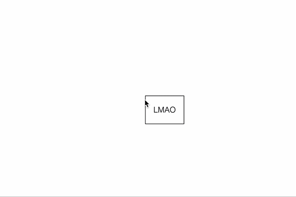
In Bootstrap 5 (not 4), you could use these pre-defined utility classes in place of the CSS written above, which essentially does the same thing:
<div id="container" class="position-relative">
  <div id="content" class="position-absolute top-50 start-50 translate-middle">
    LMAO
  </div>
</div>
3. With Auto Margins
This used to be my favourite method before Flexbox was a thing.
When you set all left, top, right and bottom to 0, and set margins of all directions to auto, the element suddenly forgets which way to go so it stays at the centre instead.
The catch is that you need to set the width and height of the content.
#container {
  position: relative;
}

#content {
  position: absolute;
  left: 0;
  top: 0;
  right: 0;
  bottom: 0;
  margin: 0;
  width: max-content;
  height: max-content;
  /* If possible, set width and height to a fixed value
     as max-content is not widely supported */
}
And here’s a bonus for you! (not really)
4. TABL… The method that can’t be said
IT’S 2023, PLEASE DO NOT USE THIS METHOD!
<table id="container" border="0">
  <tr>
    <td align="center" valign="center">
      <div id="content">LMAO</div>
    </td>
  </tr>
</table>
You could say that this was the only method we could use in the early 2000s, and sadly it’s still the most reliable way to vertically centre an element for email newsletter.
If we remain the structure as <div> instead of rewriting to <table>, you could do it the CSS way:
#container {
  display: table-cell;
  text-align: center;
  vertical-align: middle;
}
But still, this is not the recommended way. <table> is meant for tables, it’s not supposed to be used for layout setting.