
Since the introduction of Flexbox in CSS, it has become so ubiquitous that you could find it in almost every website.
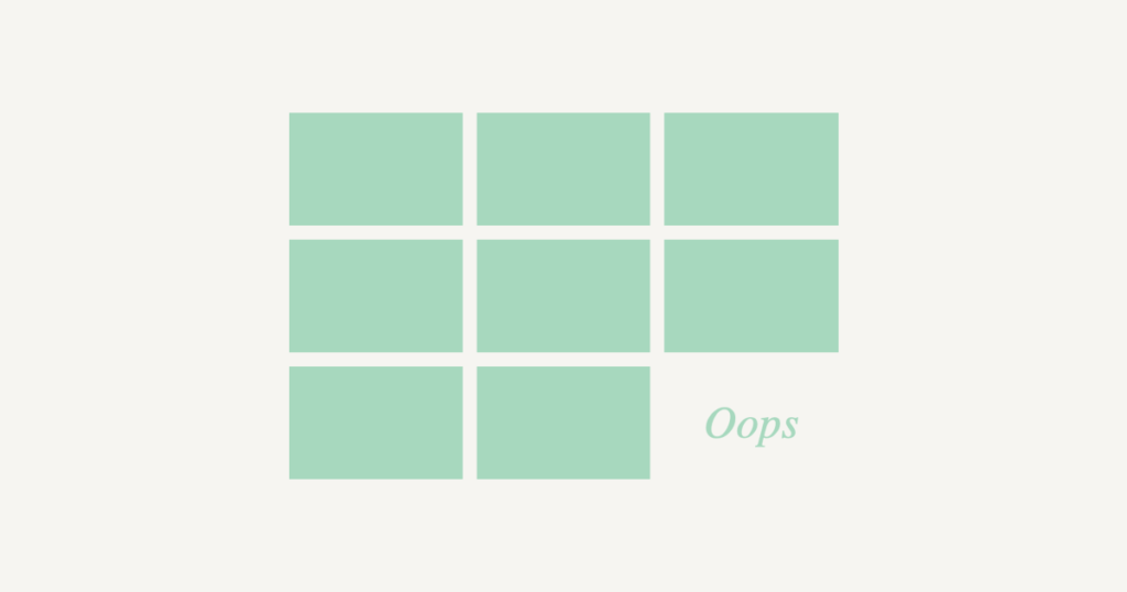
However, Flexbox doesn’t always behave as expected. For example, once you allow your child element to stretch by giving flex-grow a positive value, the last row always stretches end to end, and it may look awkward when it has less elements than other rows:
Solution: Fill It Up with Spacers
The easiest trick to solve this, is to append a bunch of empty spacers with the same css properties as other boxes, but with 0 height and 0 vertical margins:
In the case above, our container width is fixed, so 2 spacing boxes are enough. If your container is fluid, just place more spacers. You could theoretically append 100s of them in it and it will be fine!
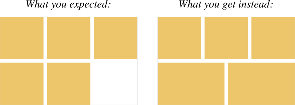
The Caveat: Gaps
The catch is, once you applied gap, or row-gap to your Flexbox container, the spacers will leave a bunch of bottom paddings in the container:
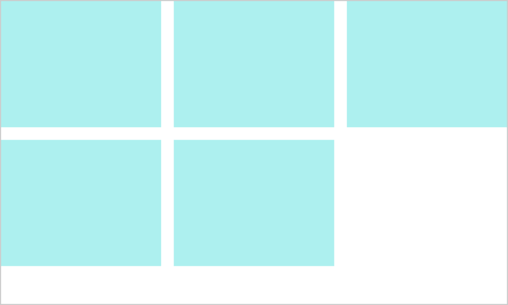
The Proper Solution: Grid
If you know Flexbox, I bet you must have heard of CSS Grid as well.
To put it simply, Flexbox is mainly designed to handle a single row of elements, while Grid is designed for multiple rows.
Therefore, the proper way to lay a grid layout (no pun intended) is to use CSS Grid instead of Flexbox:
There you go, a grid that automatically wraps and stretches its child elements while they stay intact to the grid lines.
If it looks confusing to you, don’t forget to check out these 2 CSS-Tricks pages that I use all the time as my reference: